Even at the thumbnail size, most of the shot compositions read clearly. The staging is very legible and the backgrounds are not cluttered with unnecessary detail that draws your eye away from the characters. The clearness of the compositions works well with Culhane's sense of timing. With fast shots, you want to make sure that the audience will be able to "read" a scene before it's replaced by the next one.
That's a tribute to Art Heinemann, the designer and layout artist. Heinemann had been in the Chuck Jones unit when Culhane was there as an animator and joined the Lantz studio after Culhane. Culhane thought highly of him and hired him later went he opened a studio to do TV commercials. Mike Sporn's blog has an entry about an Ajax commercial done by Culhane and Heinemann.
The backgrounds painted by Phil DeGuard, who later painted backgrounds for Jones at Warners, are done with flat colors. They are totally lacking in texture and there's no attempt to create a sense of roundness by changing the tones.
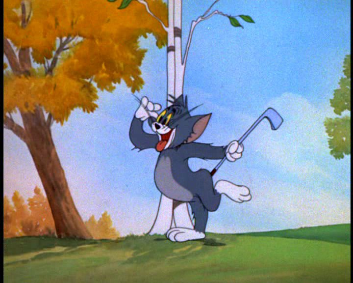
In many cartoons, there was a clash between the flatness of color on the characters and the roundness of the color in the backgrounds. Here's a still from the Tom and Jerry cartoon Tee For Two, courtesy of Kevin Langley.

Note the grass, the tree trunk, the leaves and the sky. There are lots of subtle color changes there. Then look at Tom. Every color on him is completely uniform. That's a result of the different way paper and cels take paint. You couldn't get color variation on cels unless you resorted to an airbrush, which was time consuming and difficult to control on a frame by frame basis.
This annoyed a lot of animation designers, who felt that there should be greater design continuity between the characters and the backgrounds. This was one of the main artistic goals of UPA, but the seeds were already planted at other studios and The Pied Piper of Basin Street is an example. Heinemann designed it so that the backgrounds had the same flat color treatment as the characters. (If you look at the mosaics, you will see some color variation, but that's due to video compression artifacts, not the artwork.)
Jack Kirby used to say that every comic book was an art school. The same thing is true of every animated cartoon.
No comments:
Post a Comment