Friday, June 30, 2006

More on The Reluctant Dragon

This film doesn't get the attention it deserves. It was released between Fantasia and Dumbo, though it resembles Dumbo more in its unpretentiousness. The animators were at the top of their game during this period and this film contains some beautiful comedic acting.

Before getting to that, though, I want to mention some interesting layout. Paul Teolis wrote me about Zach Schwartz teaching the dragon's introductory sequence at Sheridan and talking about how free the layout artists were with changing geography as needed. If you look at scene 20, you can see that the mound that the boy is sitting on is near a rock formation that forms a shower. Yet when the dragon dances past the boy in scene 43, that rock formation has vanished! In fact, once the dragon leaves the shower, the backgrounds are some of the sparest you'll find in a Disney feature.

Director Ham Luske definitely cast the animators by character here. In sequence 12.2, Woolie Reitherman does all of the dragon scenes and in sequence 12.4, the dragon is entirely by Ward Kimball. We usually associate Kimball with broad, comic animation, but the truth is that Reitherman's work here is far broader. Reitherman gets the honor of introducing the dragon and absolutely nails the character's personality. We thoroughly know this dragon by the time Reitherman gets done with him.

Reitherman had sort of a split personality as an animator. On the one hand, he was known for realistic, powerful action while doing characters like Monstro in Pinocchio and the dinosaurs in the "Rite of Spring" segment of Fantasia. On the other hand, he often animated Goofy, such as Goofy attempting to surf in Hawaiian Holiday. This dragon is much closer to Goofy than the Fantasia dinosaurs.

By contrast, Kimball's dragon is much more subtle. It's true that the dragon stays seated in one spot for the whole sequence and the dragon's nonchalance has to contrast with the boy's panic, but it's interesting that somebody chose to put Kimball on this sequence. His animation works fine, but his opportunites are fairly limited.

Paul Murry does a few scenes of the boy. I know that Murry has many fans of his comic book work. For years, he did the Mickey serials at the back of Walt Disney's Comics and Stories. Here's an example from issue 185 from 1956.
I have to admit that I'm not a fan of Murry's comic book work. It always seemed lumpy and ungainly to me. He handles the animation of the boy well, but seems to have trouble with the boy's hair. It's not a great hair design, but in Murry's scenes it sometimes looks a little like a loose wig. I do have to say, though, that the boy turning around in scene 25 is a lovely piece of animation.

Walt Kelly's scenes of the boy provide him with better acting opportunities than the Mickey shorts I covered in earlier entries. Kelly seems to have some trouble with the boy's hair as well, but he does keep it rooted. Scene 23 is an original solution to the motion of sitting down. The acting in scenes 35, 41 and 42.1 is very nice. Kelly had a real talent for posing in the Pogo comic strip and it appears that it was developed while he was at Disney.

One interesting thing is that Kelly's runs and walks are lacking. The run in scene 15.1 is weightless and the walk in scene 26 puts more effort into slamming the lead foot onto the ground than in pushing off with the rear foot.

Kelly definitely showed promise as an animator, but the strike cut his career short and he went into comics for the balance of his life. He did try his hand animating one more time late in life when he and Selby created the Pogo animated short We Have Met the Enemy and He is Us around 1970. By that time, Kelly's timing was rusty and some of the animation could have used more inbetweens, but Kelly's animation skills hadn't deserted him.

Last, and never least, is Fred Moore. Moore does the excellent work you'd expect from him on the boy (though even Moore seems to struggle with the hair), but the revelation here is Moore's Sir Giles. We associate Moore with round, soft shapes, whether mice, pigs or girls. Giles is thin and angular. As a design, he doesn't play to Moore's strengths, yet Moore clearly has fun with Giles lanky form. In scene 21, he gets some great poses out of Giles bathing in the tiny bucket. In scene 27, when Giles says "Preposterous!" Moore really pushes the facial expressions for comic effect.

Moore nails Sir Giles and the boy the way Reitherman nailed the dragon. And in this sequence between the two of them, Moore plays them off each other beautifully. Ham Luske knew what he was doing when he assigned these two animators to the three star characters' entrances. By the time this sequence is finished, we know there's a confrontation coming and we can't wait to see how it plays out.

Thursday, June 29, 2006

Excerpts from The Reluctant Dragon


Courtesy of Hans Perk, here are animator identifications for sections of The Reluctant Dragon. The film is available on the DVD Behind the Scenes at the Walt Disney Studio, an essential item for anybody interested in Disney history and technique.

I'll have more to say about this in a future entry.

Wednesday, June 28, 2006

YouTube is the new Vaudeville

Once upon a time, before the internet, before cable, before TV, before radio and even before movies, there was Vaudeville. There were theaters in every city and town in North America and entertainers who spent their whole lives on the road, facing audiences as many as five times a day in the less prestigious venues.

It was the greatest school for entertainment ever invented. Why? Because entertainers got feedback directly from audiences and had the opportunity to hone their material and styles taking audience reaction into account. If you were good, you kept going; if you weren't, you were cancelled. It was a brutal school, but those who succeeded gained knowledge that kept them on top for the rest of their lives and through several media revolutions.

The Marx Brothers, W.C. Fields, Buster Keaton, Charlie Chaplin, Jack Benny, George Burns and Gracie Allen, Bob Hope, Bing Crosby, Fred Astaire, Judy Garland, Will Rogers, Red Skelton, The Three Stooges, and Mae West were just some of the entertainers who honed their craft in vaudeville and then were able to move into movies, radio and television. They knew what audiences wanted and were able to deliver it.

The best thing about Vaudeville was the ease of entry. It wasn't hard to get a chance to perform. The only person you had to convince was the theater manager, and if you couldn't convince one, there were hundreds of others to call on.

As modern media developed, there were fewer venues and production became more expensive. With only three networks for radio and TV and less than a dozen movie studios, time in front of an audience became precious. The media were not about to take a chance on untried talent or ideas. There was too much money at stake. In order to reduce risk, the media created gatekeepers who only accepted what they thought the audience wanted to see. Those gatekeepers naturally wanted to keep their jobs, so they stuck to the tried and true.

Now things are changing. Anyone can put something on YouTube.com. Scott Kirsner reports that YouTube is developing an advertising scheme that will split revenue with the creator of a clip. Through advertising, you now have the opportunity to sell your work directly to the public without having to go through a gatekeeper.

We're back to Vaudeville's ease of entry. And because anybody can easily see how many times a clip has been viewed, creators (and advertisers) can now gauge audience response directly. We've got the same opportunity to learn from the audience that Jack Benny had.

Somebody is going to create a cartoon character and feature it in a series of shorts on YouTube. If the shorts are good, the audience will build and the advertising revenue will increase. Eventually the revenue will allow the creator to focus exclusively on the character, and more revenue will come from making new shorts and selling merchandise. Film or TV companies will come sniffing around because they're interested in anybody who can attract an audience. They'll offer the creator a feature or TV series starring the character.

Somebody in animation is going to become the next Chaplin or Astaire. It's just a matter of time.

Tuesday, June 27, 2006

Animators and Acting Part 3

(For those interested, here are part 1 and part 2.)

The speed at which animators work (or rather the lack of it) is responsible for many aspects of animation production. It’s also something that separates what animators do from what live actors do.

One thing that live actors do is rehearse. They do this in order to help learn their lines, but an equally important part of rehearsal is to work out staging. What kind of relationship should characters have with each other in a scene and how should it be expressed? When should an actor sit down or stand up? When should an actor pause and look at the floor? These are the kinds of behavioral details that actors work on in rehearsal.

In the case of a play, rehearsal may last for weeks. Film directors hope to get a week or two for rehearsal before shooting starts, but even if there’s no time, there’s always the possibility of multiple takes. Actors may need half a dozen takes to really nail a shot, but that’s an accepted part of the process.

If every animator did every scene six times, no film would ever get finished. Animators are too slow to allow them to rehearse, so the rehearsal function has migrated upstream to the story department.

In features, story artists are part directors, part writers, part layout artists, part actors and part editors. I’m concerned here with where they overlap with the function of acting. Story artists have to understand the emotional beats in a sequence and their job is to make sure that the staging, character business and poses all work towards communicating those emotions. Because story artists are using fewer drawings than animators (and often drawing more loosely) they are the ones with the opportunity to try a sequence in different ways until they find the approach that works best.

Even in TV animation, where the story artist is expected to stick to the script and has no time to try variations, the story artist still works to make the characters’ physical business and emotions clear. In cases where animation is being sent to a subcontractor, there may also be a character layout stage refining and adding poses before the animator gets the shot.

By the time an animator gets started, the emotional arc and the physical business have been determined by the voice track, the story sketches and possibly the character layouts. The animator is free to do thumbnails to refine what he or she has been given, but the animator has much less room for interpreting the script than a live actor would.

The animator may have a better idea, in which case the voice track and story sketches may be reworked, but the realities of budgets and schedules mean that there are limitations as to how often this can be done. In TV, it’s almost never done, as the schedules are so tight that producers are uninterested in anything that will slow down production.

Though it varies from project to project, animators are not so much actors as refiners, taking what they’re given and polishing it as best they can. There are more ways this is true than I’m detailing here and future entries will explore other limitations that are placed on animators.

Monday, June 26, 2006

Scott McCloud

I hope that everybody is familiar with Scott McCloud's book Understanding Comics. There's a lot about design and visual storytelling in the book that applies to animation. McCloud has a new book coming out in September called Making Comics, and he's doing a lot of interviews to promote it.

This one talks a lot about webcomics and distribution. There's no question that it takes less time and effort to create a comic than an animated film. However, because comics are taking advantage of the web, creators are reaching an audience and the field as a whole is being enriched by new voices. Here are a few quotes from McCloud about the advantages of the web.
That's the big difference with digital distribution and webcomics -- there's no penalty to having a small readership. If you have a small readership, you have a small readership. But you get to keep it, because your work is always available. If you go into an average comics shop -- or even a Borders or Barnes and Noble, for all their tremendous variety and selection compared to previous eras -- it's a different situation. A comic which isn't expected to sell at least a few thousand right out of the gate will not be seen at all. It will never appear.

It's the principle that any given square inch of shelf space needs to generate a certain amount of revenue for a shop to survive. And so the people who buy the material for that shelf quite reasonably try to skew their ordering toward those products that are going to sell to the highest number. And if you have five genres, and one sells to 40 percent of the fans, one to 30 percent, and one to 10 and one to five, etcetera, the one that sells to the 40 percent is going to take up 80 percent of those slots.

I just boil it down to: There's no shelf space in cyberspace.

There's limited "shelf space" in movie theaters and on TV and that's why there are gatekeepers to filter out what they think won't sell sufficiently well to make them a profit. The person or company who figures out how to make a profit from animation on the web is going to revolutionize the business and open it up for new creators.

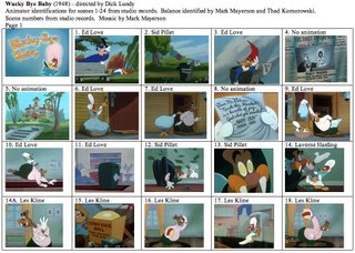
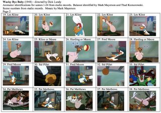
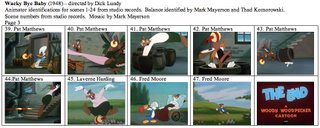
Wacky Bye Baby


I've got the studio documentation for this cartoon, but for some reason, it doesn't include animator credits after scene 24. Clearly a studio oversight.

Thad K. and I have put our heads together to figure out the rest of the scenes. There are scenes where we are in strong agreement (30 through the end), but scenes 25 to 29 are a bit iffy, which is why I listed more than one animator as a possibility. If this whole sequence is Moore, it is not Moore at the top of his game. There are poses and bits of timing that suggest Moore, but they are not strong enough to negate the possibility of Thad's suggestions of Les Kline, Laverne Harding or even Ken O'Brien.

I see some Moore-ish poses even in scenes that the document identifies as Les Kline, so perhaps Lundy had Moore do character layouts for other animators, which would explain some of the confusion if it was the case.

If anybody would like to offer an opinion, please comment.

Lundy is casting strongly by sequence here. Ed Love gets the entire opening. Les Kline gets the start of the ball sequence, which is finished up by Moore and/or Harding. Pat Matthews gets the wild action for the climax, with Moore finishing up with the end gag.

I had the pleasure of getting together with Bob Jaques a few weeks ago and he was laughing at the story for this cartoon. How absurd is it that Wally wants to adopt a baby and then decides to blow up his child with dynamite?

I often wonder how interested Lundy was in stories at all. His Lantz cartoons give me the impression that he'd take any story he was handed and then spend his efforts to make it as attractive as possible. I don't get the sense that he was able to punch up a weak story or pull it into shape. Besides that, he was more partial to fall guy characters than he was to hecklers. Lundy's Donald Duck and Barney Bear cartoons confirm this. In this cartoon, he seems more interested in Wally Walrus than he is in Woody.

After initially fooling Wally into thinking that he's a baby, Woody really only does one thing to go after Wally, and that's throw the metal ball from the andiron at him. Wally is the one who provokes it with the trick ball and Wally is the one who puts dynamite into the trick ball he knows will always come back. All Woody has to do is watch Wally destroy himself.

If the pleasure of watching a heckling character is vicariously getting our aggressions out, this cartoon isn't very satisfying.

Saturday, June 24, 2006

Digital Distribution

I want to point you to this blog entry about digital distribution. Continue reading to the bottom of the entry, as it comes back to distribution at the end. Scott Kirsner's blog Cinematech covers all sorts of issues, but he keeps a close eye on the way the economic and distribution models are changing. Peter Broderick is quoted as saying, "The old rules don't apply anymore but the old rulers don't realize it yet."

I'm convinced that the future of animation doesn't lie with large studios or broadcast networks. Their overheads are so high and their investors are so hungry for profits that they've got to keep aiming at the largest possible audience. As a result, they're the ones least likely to try new things.

You don't need to create the #1 film or the TV series that everybody's talking about. You only need to create something that makes enough money to pay your bills and allows you to keep creating. That applies to both individuals and small companies. With the increasing opportunities to reach an audience, I hope that more people in animation explore these possibilities.

Friday, June 23, 2006

Fred Moore's Woody Woodpecker

Fred Moore's late 1940's version of Woody, taken from The Walter Lantz Story by Joe Adamson. You can see Moore's work on Andy Panda here and here, courtesy of Thad K. And of course, for a large sampling of Moore's drawings, check out Jenny Lerew's Blackwing Diaries.

Thursday, June 22, 2006

Hogan's Alley

Issue 14 of Hogan's Alley is now out. The magazine specializes in articles on comics and animation. The new issue contains Jim Korkis's interview with Bob Clampett, concentrating on the Beany and Cecil years. It also includes Mark Arnold's interview with animation voice artist Thurl Ravenscroft and Arnold's article on The ABC of Hand Tools, a cartoon Disney made for General Motors in the 1940's.
It doesn't look like Hogan's Alley has updated their website yet, so check your local comics shop. I'm sure that Bud Plant will eventually carry this issue. You may be interested in interviews with Disney story man Bill Peet and animator Marc Davis posted on the Hogan's Alley website.

More on The Little Whirlwind

The more I examine the animator drafts that are coming to light (and I'm grateful for each and every one of them), the more I realize that our understanding of Disney animation is terribly incomplete. There are animators like Les Clark, whose work in the features isn't all that celebrated, yet here he is doing excellent work that deserves to be talked about. That goes for his scenes in Mr. Duck Steps Out, too.
And it seems that each draft reveals a hidden treasure: Paul Allen in Mr. Duck, Cliff Nordberg in All The Cats Join In and in this cartoon, John Elliotte. He was credited on features throughout the 1940's, but I've never read anything about him and am not aware of any of his feature scenes being identified.

While we know about effects animators like Josh Meador, Ugo D'Orsi or Cy Young, this cartoon has a crew of mostly anonymous effects people who do excellent work.

I can only hope that more of these drafts will come to light, especially for the features. I think that there are surprises awaiting us and many unsung animators whose work deserves recognition. The Nine Old Men are not the only Disney animators worthy of attention and some of them, like Les Clark, haven't gotten the attention they deserve.

This cartoon is a case of many hands all working at a high level. You've got typically great animation by Les Clark, Ward Kimball and Fred Moore, but they don't dominate this cartoon's footage the way they do The Nifty Nineties. Instead, animators like Duncan, Jones, Muse, Woodward and Elliotte manage to do personality-oriented action that maintains the standard, followed by straight action done by James Armstrong and Walt Kelly that makes for an exciting climax. Kimball and Moore return to wrap things up.

Just about every animator here has a highlight scene. Les Clark's entrance for Mickey is a walk that verges on dance. It overflows with personality. Clark also did Donald's first scenes in Mr. Duck, so it appears that he was counted on to set the tone for a character. Ward Kimball's best scene is number 13, where Mickey rakes leaves to the music. Moore follows Kimball in this section and you can see his poses in the model sheets I posted yesterday. Two of Moore's shots run 24 seconds or more (16 and 18), yet they never flag. There's not much in the way of gags in Kimball's and Moore's scenes in this section; the appeal comes strictly from how Mickey moves. That's a testimony to their ability to come up with poses and timing that satisfy your eye.

Ken Muse doesn't have much work in this cartoon, but scenes 25 and 26 are a well done comic struggle with the basket.

This is followed by John Elliotte's work. If I didn't know better, I'd think it was Fred Moore's. He seems to have caught Moore's Mickey proportions well and while his posing isn't quite up to Moore's standard, it's pretty darn close. He draws flexible shapes and has strong contrast in his timing. He has a talent for comic action that keeps Mickey's personality front and center. Mickey sneaking around the building includes some funny foot animation and a good take. The battle with the whirlwind in the bag is some of the best material in the film.

I wish I knew more feature scenes that Walt Kelly animated, because it appears from the shorts that he was considered an action animator. Mickey's run away from the tornado is well done and Kelly does some nice perspective animation of Mickey in the bucket. James Armstrong gets a lot of extreme long shots, but the few places where Mickey is a decent size (scenes 34 and 54) he handles Mickey well.

The whirlwind and its larger version are beautifully animated. Both have personality in addition to good rendering treatments. I don't know who did the marching leaves (either Woodward or Harbough), but they always make me laugh.

There are 27 animators on this cartoon! Contrast that to the half dozen or fewer who would animate on a typical Warner Bros. cartoon. Only the Disney studio had a staff so large that it could throw so many people at a short. And maybe Disney was the only studio where the staff was skilled enough to make a cartoon look consistent when drawn by so many hands.

Wednesday, June 21, 2006

Fred Moore Drawings from The Little Whirlwind


I suspect that many of you have copies of these model sheets (possibly better copies than those above). But if you are unfamiliar with these, they're drawings by Moore from scenes 16 and 18 of The Little Whirlwind.

They're not in the order that they appear in the cartoon. And it's interesting to see how loosely Moore treats the pile of leaves in the upper left corner of the second sheet. Whoever his assistant was on this film, he had to meticulously draw the individual leaves. While that doesn't sound like fun, I'll bet there were assistants who would have gladly done it for the opportunity to work on Moore's drawings.

Barbarians at the Gate

It's official. The bottom feeders have arrived. American Greetings and DIC have announced a cgi Strawberry Shortcake feature, due in theaters in October 2006. Details here.

Tuesday, June 20, 2006

The Little Whirlwind


My thanks to Hans Perk for publishing the animator draft for this cartoon. Alberto Becattini's website was a huge help figuring out who some of these artists were. I'll talk about this cartoon, available on the DVD Mickey Mouse in Living Color Volume Two, in a later entry.

Monday, June 19, 2006

Still Swallowing Our Tails

Thanks to Paul Teolis, I want to point out this article, entitled "Computer-made cartoons might be nearing a creative crash." I think that a lot of the article is wrong-headed, and as somebody who spent 20 years working in computer animation, I think singling out the medium is as wrong as singling out drawn animation was a few years ago.

But the importance of this article is twofold. First, the critics are beginning to see the sameness of the films. Second, journalists are famous for reading other journalists and parrotting their ideas. When the public reads the same message about animation in every article they see, that's how conventional wisdom gets born.

And while I don't want to review either Over the Hedge or Cars, I want to point out the similarities in their stories. A character with a selfish goal meets other characters who are more community oriented. When the character has the opportunity to realize his goal, he abandons it because he's adopted the values of his new-found friends. The two films are different in that R.J. in Over the Hedge attempts to exploit the other characters where Lightning McQueen in Cars wants to escape them, but the films start and end in the same place. They're just developed differently in their second acts.

As I said earlier, we've got to enlarge the gene pool or our creative babies will be born with two heads and the public won't want to be seen with them.

Vintage Animated Commercials


Mark Evanier linked to this ad today, mentioning that Paul Frees and June Foray provided voices. He didn't mention that it was produced by Shamus Culhane and the characters were designed by Art Heinemann. I don't know who animated it.

Looking around YouTube.com, I found several other vintage commercials of interest. This one for Alka Seltzer was designed and laid out by William Steig and narrated by Gene Wilder. Michael Sporn published Steig's layouts for the commercial here.

This Black Label ad was clearly split in half by two different animators. Greg Duffell told me that he thinks that the first half is animated by Rod Scribner.

Here's a very early Rice Krispies commercial, interesting for the designs on Snap, Krackle and Pop. Not to mention how changing social mores give this film a suggestiveness it was never supposed to have.

This King Vitamin commercial was most likely produced by Jay Ward.

Here, in case you haven't already seen this, are Fred and Barney shilling for Winston cigarettes.

Saturday, June 17, 2006

Preston Blair's Sorcerer's Apprentice


This comes from an issue of Cartoonist PROfiles, though I don't know which one. Space has always been at a premium here, and I've torn articles out of magazines for years in order to keep my files under control. I've been good lately at noting the titles and issue numbers of articles, but I neglected to do it for this piece. If anybody knows the issue number, please comment.

Blair claimed in the accompanying text that this was the first scene animated for The Sorcerer's Apprentice. He also mentions that the assistant for this scene was Ken Muse and that live action of a UCLA athlete was filmed for reference. Blair states that the athlete had long hair and he used it as a guide for the follow through on Mickey's robe.

I wonder if these images are tracings Blair did of his originals, as some of the figures overlap. However they were assembled, they're lovely to look at.

Walt's People Volume 3 now at Amazon

Editor Didier Ghez informs me that Walt's People Volume 3 is now available through Amazon.com and Amazon.ca. Xlibris.com, the publisher, would only ship the book via UPS, which charges an obscene amount to ship material outside the U.S.

If you missed earlier information on this series of books, it consists of interviews with people who worked with Walt Disney, ranging from the 1920's until after his death. The interviews include many famous animation figures. You can read my earlier blurb about the series here. I know that at least two more volumes are already in the works.

If you are interested in animation history, live outside the U.S. and haven't ordered this book yet, this is your opportunity.

Thursday, June 15, 2006

Swallowing Our Tails

Brad Bird says that animation is a medium, not a genre. He's right in principle, but the animated family film is most definitely a genre the same way that teen comedies and thrillers are. Here's just a few elements that are common to just about every animated feature released in North America:

1. Fantasy elements.
2. Children as prominent characters.
3. Songs (either sung by characters or on the soundtrack).
4. Celebrity voices.
5. Villains or their sidekicks played for comedy.
6. Burp and/or fart gags.
7. Feel-good themes.
8. Happy endings.

Feel free to add to the list.

There's a new trailer for The Ant Bully online. I'm not going to comment on the trailer one way or the other, but I am going to point out the presence of an exterminator as a villain. I just saw an exterminator as a villain in Over the Hedge.

The films are starting to blend together. Two recent features both used the hoary old gag of a character being mistaken for a god. Was it The Wild and Ice Age 2? I swear I can't remember.

We had A Bug's Life and Antz and now The Ant Bully. We had Finding Nemo and Shark Tale. We had Madagascar and The Wild. And we're due for a plague of rats. There's Ratatouille, Flushed Away, Rats Amore and One Rat Short.

When you take the genre conventions and add settings or subject matter that have already been done, you're in danger of boring the audience.

Something very interesting happened in the comics field that may relate to what's going on in animation. From the 1960's onwards, comics fans argued for longer, more serious works. While Marvel and DC, the two main companies, did adapt to a degree, they stuck with superheroes and continued to market to their established fan base.

Cartoonists finally took matters into their own hands and started doing personal work that broke out of genre conventions. Between the importation of Manga and mainstream publisher interest in the graphic novel, Marvel and DC have been reduced to minor players in terms of sales and artistic importance.

There are big economic differences between the comics and animation fields, but with the increase in distribution outlets available, there's a chance that the studios producing animated features might find themselves in the same situation as Marvel and DC. They'll continue to be profitable, but the real action will be elsewhere. If the animation industry continues to make cookie cutter movies, they're just inviting it to happen.

Wednesday, June 14, 2006

Revolving Voices and Changing Heights


Dumbo was a relatively low budget production at Disney and there are some rough edges in it. Some of the strangest things, though, are in the song, "When I See an Elephant Fly."
And they tell me that a man made a vegetable truck.
I didn't see that. I only heard.
Just to be sociable, I'll take your word.
I heard a fireside chat.
I saw a baseball bat.
And I just laughed till I thought I'd die.
For this section of the song, there are 5 or 6 voices on the soundtrack that the characters lip synch to, but there are only 3 crows on the screen! The crow with the striped shirt synchs to 2 or 3 voices, the deacon-ish crow synchs to 2 and the tubby crow synchs to one, but it's not the voice that he speaks with earlier in the film. Furthermore, when the film cuts from a long shot of the two crows to a close-up (see the top two images), the crows have reversed positions!

It's hard to know what they were thinking when they did this. Did they just assume that the audience wouldn't notice? Was there a mistake identifying the voices on the sheets? Did they decide to restage this after the track was recorded?

Dumbo wasn't the only time that the studio did odd things. Take a close look at the Mushroom Dance in Fantasia. Start watching any one mushroom (except for the baby) and follow it through the whole sequence. The mushrooms morph from tall to short and vice versa. This was consciously done by animator Art Babbitt, but why? It's not instantly obvious to the audience. Did Babbitt ever go on record explaining his thinking on this?

Tuesday, June 13, 2006

Theatrical Cartoons of the 1960's

Greenbriar Picture Shows has an entry about theatrical cartoons of the 1960's, including budget and income figures. If you don't understand why short cartoons disappeared from theaters, this will explain it.

Monday, June 12, 2006

More on All the Cats Join In

Hans Perk pointed out that I mislabeled shot 33 as Tom Bertino when it should have been Albert Bertino. I've made the correction. Tom Bertino is a modern day visual effects supervisor, which is why I got confused. I should point out that in this mosaic, the shot numbers are from Disney studio documentation.

This short is part of Make Mine Music, a kind of Fantasia for 1940's music. Disney also made Melody Time in this vein. If you are unfamiliar with these two films, you should see them. While they don't contain the drama or acting challenges of the earlier and later Disney features, they employ a wide range of design styles and contain lively, unpretentious animation.

This segment is an early music video and is all about movement, making it a great jumping off point for discussing the work of different animators. Watch how they deal with shape, proportion, timing and flexibility.

John Sibley opens the cartoon with some fairly low key animation that really only takes off with scene 10. He's back later with much better stuff. Andrew Engman is probably more of an effects than character animator and he carries us into Fred Moore's scenes.

Notice Moore's version of the blond boy in scene 15. He's got a larger head and a lower waist than the version drawn by Sibley in scene 8. The differences are subtle, but Moore's proportions and shapes are just more appealing than other people's work in this cartoon. His animation of the big and little sisters is just gorgeous. Great proportions, shapes, poses, timing and follow through. He does the best work in this cartoon, bar none.

The sisters get taken over by Milt Kahl, who does a pretty good job of keeping Moore's spirit, but there are differences. In scene 24 Kahl draws big sister with a smaller head and a longer body than Moore. While his timing is every bit as good as Moore's, his shapes are not as appealing and his drawings don't flow into each other as well. Kahl's lines are not as rhythmic as Moore's. You can argue that Kahl was a more versatile draftsman and actor, but he loses to Moore on appeal.

Just like Paul Allen was the hidden treasure in Mr. Duck Steps Out, Cliff Nordberg gets the prize for this cartoon. This was Nordberg's first credited feature at Disney, though he might have worked uncredited on shorts. He stayed at the studio through The Fox and the Hound. Nordberg's drawings are pleasing and his animation is very loose-limbed and full of energy. Does anyone know if Nordberg was ever interviewed?

By contrast, Hal King's work is stodgy. He's not one for much stretch and squash and he doesn't push his timing.

Bill Justice does some of the dance animation in the malt shop, and there's a bit of a rotoscope look to it. This film is rarely discussed, so I have no idea if reference footage was shot for the dancers, though I wouldn't be surprised. There's something about the proportions in some of Justice's scenes that suggest that he's working off of photostats. Justice is a good animator, but dance animation is hard and he may have had some difficulty with it.

Sibley and Nordberg wrap up the cartoon. Sibley has fun with the 1920's refugee. Nordberg's group dance scenes are beautifully broad and Sibley follows him up with some acrobatic dancing.

Jack Kinney clearly knew who his best animators were. He's got Sibley opening and closing the film. He's got Moore and Kahl on the most extensive personality animation in the film: the big and little sisters. Nordberg is sprinkled throughout the film to keep the energy up. Justice and King are a little flat, but they keep things going. Engman's scenes do their job, connecting everything together.

There's no dialogue, no real conflict, and no brilliant gags. There's just music and motion. When they're done this well, that's enough.

Saturday, June 10, 2006

Serial Distribution

Scott Kirsner has a blog entry about serial distribution here. Greg Joyce is taking his live action feature and breaking it up into segments that will be serialized on Brightcove for free. Kirsner questions whether something made as a feature will work in bite-sized chunks, but does think that the idea of a serial is a good one if the work has been created for that format to begin with.

I think there's a market for a weekly 1 minute animated film that's serialized. I think that the best approach, rather than create original content, might be to parody a weekly TV series. Take Desperate Houswives, Lost or 24 and parody the most recent episode before the next episode gets on the air. That way, your show is attractive to a ready-made audience. If you can build a large enough audience, you can sell advertising or do product placement within the segment. If the project is successful, you might even be subsidized by the producers of the show you're parodying, as they'll see it as publicity. If you've got a hit, you might get other producers approaching you to parody their show.

A parody might become a standard part of a show's marketing. It would make a great DVD extra when they release a complete season of a show. If there are 22 episodes done for a season, then your 22 minutes of parody is the equivalent of a half hour special.

Once you've built an audience and a reputation, that's when you start doing original content that stands by itself.

The tough part is staying alive until the project becomes profitable. I think that small studios that already have staffs, equipment and clients might be in position to pull something like this off.

Friday, June 09, 2006

Animators and Acting Part 2

We know how expressive the human voice is. Meaning doesn't just come from the words, it also comes from how the words are spoken. Live actors use their own voices when playing a role and for many actors, whether dramatic or comic, the voice is a major tool for communicating with the audience.

Animators rarely provide the voices for the characters they animate. Instead, they're handed an existing voice track. Usually the animator is not present at the recording session and has no input into how the lines are spoken. The voice track is a fait accompli that the animator must deal with in creating the visual performance. As animator Tissa David once said, the performance is in the soundtrack; it's the animator's job to pull it out.

So far as acting is concerned, the voice track dictates several things to the animator. The first is emotion. A line of dialogue can be read different ways depending on the emotional state of the character. The actor makes this decision and the animator is tied to it. If the character is angry or hurt or confused while saying a line, the animator is forced to portray that emotion or the performance won't be believable.
Another thing the actor dictates is timing. How quickly or slowly does a character say a line? Besides having a direct impact on the speed of the mouth and face, the tempo of the dialogue may also dictate what kinds of gestures will work in the allotted time.

Finally, the actor determines emphasis. For the line "I'm not going to school," you can put the emphasis on "I'm" or "not" or "school." The animator's choice of poses will be different depending on which word the voice actor emphasizes.

The voice actor has to dominate the animator if the visual performance is going to work. In fact, the voice track is one of the things that holds an animated performance together, given that multiple animators will most likely perform the same character.

These things are true for any voice; they don't begin to account for the associations that a well-known voice brings to a character. Actors such as Robin Williams or Eddie Murphy remind us of previous appearances when they lend their voices to cartoons. In cases like these, animators have the additional burden of bringing aspects of an actor's persona to the way that a character behaves. Animation is sometimes reduced to being make-up or a costume applied to a live performance.

In live action, dubbing is inherently false. We're not getting the actor's voice, we're getting an approximation. Because dubbing comes after photography, the visuals drive the soundtrack. In animation, the soundtrack comes first so it drives the visuals. The animator is forced to be the servant of the voice actor, embellishing an existing performance.

Actors interpret scripts. Animators interpret actors.

Ratatouille Trailer

The Ratatouille trailer is now available in English here.

Wednesday, June 07, 2006

30 Years Ago Today...

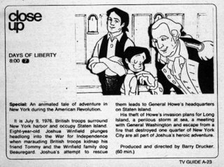
...on June 7, I started working in the animation business at a hole-in-the-wall N.Y. studio called Teletactics. The project was a one hour TV special for the local ABC-TV station called Days of Liberty. On my first day they didn't have a scene ready for me, so I ended up doing inbetweens on a scene animated by John Canemaker, now the noted animation historian, teacher and Oscar winning short film maker. I'm sure that John would agree with me that Days of Liberty was nobody's finest hour.

My pay was a princely $135 a week. The quota was 30 drawings a day. We had no assistants, so we cleaned up and inbetweened our own scenes. No pencil tests were shot. The first time we saw our scenes moving, they had already been inked, painted and photographed. It was a frustrating and scary way to work.

The studio was composed of people at near the start or end of their careers: Yvette Kaplan, later a director for Beavis and Butthead, King of the Hill and story person for Ice Age; Dave Burd, who went on to perform on the Uncle Floyd Show; Milt Stein, longtime animation veteran and funny animal comic book artist; and Selby Kelly, recently-widowed wife of Pogo's Walt Kelly and herself a veteran of Disney and Chuck Jones.

While the TV guide blurb credits the direction to Barry Drucker, it was actually by John Lopez. You can always count on fly-by-night producers to have a Walt Disney complex and hog all the credit. If Drucker had any taste, he would have taken his name off the show.

It aired on December 11. I was laid off in November, which turned out to be a stroke of luck. I managed to find my next job before the market was flooded in January when Raggedy Ann and Andy laid off its crew. Zander's Animation Parlour hired me as an inbetweener for commercials, and I went from one of the weakest studios in N.Y. to what was definitely one of the best.

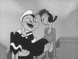
Popeye on DVD

You'll probably be reading a lot about this today, but Warner Bros. and King Features have finally come to an agreement that will see the Popeye cartoons released on DVD starting in 2007.

Here's a press release stating details. I would like to mention that animation historian Jerry Beck is involved in the restoration and release of these cartoons.

From an animation history standpoint, this is wonderful news. Max and Dave Fleischer headed up one of the most influential studios of the 1930's. Their cartoons, made in New York and Miami, are far more urban, ethnic, surrealistic and offbeat than the cartoons made in Hollywood. Unfortunately, their cartoons are barely represented in the home video market. There was a Betty Boop VHS set several years ago, but Republic Pictures has not released it on DVD. The Talkartoons, the Screen Songs, etc. are also not available on DVD.

The Popeye cartoons are arguably the best series the Fleischers ever did -- certainly it was the longest lasting -- and it contains work by Willard Bowsky, Orestes Calpini, Shamus Culhane, Al Eugster, Myron Waldman, and others who deserve more attention. The Famous Studios Popeyes, while not as highly regarded, still contain animation worth studying by John Gentilella and Jim Tyer among others. The Popeyes contained excellent voice work by Jack Mercer, Mae Questel, Gus Wickie and Jackson Beck.

Warner Bros. and King Features are to be applauded for making this happen. Let's hope that the companies that hold the rights to other Fleischer cartoons will follow their lead.

Tuesday, June 06, 2006

Today's Links

John K. has an essay on the principles of good cartoon drawing.

Larry Tremblay has an essay on how to recognize the work of different animators. As an example, he looks at the different ways animators drew a character in the WB cartoon Puss N Booty.

Kevin Langley has posted some layout drawings and background paintings from the Tom and Jerry cartoon Million Dollar Cat.

Monday, June 05, 2006

Animators and Acting Part 1

It's a cliche to say that animators are actors with a pencil (or these days, with a mouse). What animators do is acting, but it's completely different than what live actors do. An animated performance is far more fragmented and far more collaborative than any performance by a live actor.

I'm going to do a series of posts about this as it's the topic of a Masters thesis I'll be writing in the coming year. The first thing I want to talk about is that animators share characters in a way that live actors rarely do.

The first animated films by Blackton, Cohl and McCay were individual efforts. They did everything themselves, so there was no sharing of a performance. McCay hired an assistant, John Fitzsimmons, to help out on Gertie the Dinosaur, but Fitzsimmons just traced back all the backgrounds as no one had figured out how to use cels yet. So we can say that from a performance standpoint, McCay is Gertie.

Once studios came into being for the regular production of animated films, things changed. Dick Huemer talks about how work was split up on Mutt and Jeff cartoons in the teens in his 1969 interview with Joe Adamson.
"We were given a portion of the picture, over a very rough scenario. Very, very sketchy, no storyboards like we have today, nothing like that. The scenario would probably be on a single sheet of paper, without any models, sketches or anything. You made it up as you went along. You were given a part of the picture and you did what you wanted. If it was a picture about ice-skating, you took a scene of somebody on ice skates and you used your own gags and made it all up."
This was hardly conducive to consistent performances. Later on, with model sheets and storyboards, scripts were better worked out. However, the splitting of a performance between animators continued to occur. The only exceptions were the rare cartoons animated by a single person (Plane Crazy by Iwerks, Rabbit Rampage by Washam, etc.) and the occasional cartoon where one animator got all of a character, such as Tytla animating the giant in The Brave Little Tailor or Preston Blair's animation of Red in Avery's MGM cartoons.

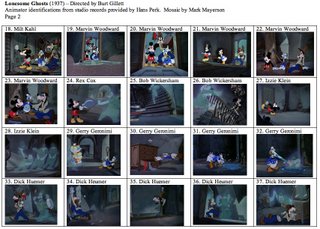
The norm is for multiple animators to handle a single character. Looking at Lonesome Ghosts, you have Ed Love, Izzie Klein, Milt Kahl, Marvin Woodward and Roy Williams all handling Mickey Mouse within the cartoon. Even in Disney features where we associate particular animators with specific characters, there are more hands involved. For instance, documents published by Mike Sporn show that in the opening scenes of Pinocchio, Ward Kimball, Ham Luske, Berny Wolfe and Don Towsley all animated Jiminy Cricket, where Kimball is usually credited with the character.

This remained the standard into the '90's, when the Disney studio was still casting animators by character. Glen Keane was the supervising animator on the Beast in Beauty and the Beast, but Aaron Blaise, Geefwee Boedoe, Brad Kuha, Tom Sito, and Anthony de Rosa all animated the character as well.

Live actors sometimes share a character. The most obvious example is when two actors play a character as a child and adult. Stunt doubles have been common in films at least since the 1920's. Now there are digital doubles as well, so there may be multiple people contributing to what we think of as a live action performance. However, the idea of doubling came about to prevent injuries to actors, not to compromise their performances.

Mike Barrier believes that having one animator handle a character is the only way to create a great animated performance. He discussed this on his website with contributions by myself and others starting on August 26th, 2005 and continuing at least until the following January. My point isn't that Barrier is wrong, but that this approach is often impractical given the limitations of a production schedule and budget. Furthermore, I believe that the nature of animated acting is far more fragmented than anyone realizes. The collaboration of several animators on a single character is only the tip of the iceberg when it comes to how animators are different from live actors.

Sunday, June 04, 2006

More on Lonesome Ghosts

I learn a lot putting together these mosaics and I also find that by revisiting a cartoon, I inevitably reconsider my opinion of it.

Lonesome Ghosts was directed by Burt Gillett, who started in animation in 1916 at the Barre-Bowers studio. Gillett had previously directed The Three Little Pigs at Disney before taking over the Van Beuren studio in New York, where he was charged with improving the quality of their films. He pushed that studio into color production and tried licensing outside properties such as Felix the Cat and Toonerville Folks. While there's no question that he raised the standard, Gillett and Van Beuren became victims of a business decision. Their distributor, RKO, signed a deal with Disney and RKO didn't need two animation suppliers.

Gillett returned to Disney but didn't stay long. He moved on to the Lantz studio and seemed to vanish from the animation business in 1940, even though he lived until 1971. The only account of Gillett I can remember reading is in Shamus Culhane's autobio Talking Animals and Other People. Culhane implies that Gillett had bipolar disorder.

While he directed The Three Little Pigs, a cartoon famous for developing individual personalities, the truth is that Gillett wasn't all that good at characterization. No memorable characters emerged from his time at Van Beuren or Lantz and this cartoon introduces four heckling ghosts who are not well differentiated. Except for one being short, they are completely interchangeable.

The story in this cartoon is also particularly weak. Mickey, Donald and Goofy are relatively passive. They start the cartoon asleep and are only moved to action by the ghosts. Working individually, they react more than act and the ghosts get the better of them. They "win" purely by accident; they crash into a supply of molasses and flour and scare the ghosts away by chance.

This is a far cry from the active Mickey of earlier cartoons like The Mail Pilot or Two Gun Mickey. Mickey is still determined here, but far less resourceful than previously. Donald is frustrated and Goofy is dumb, but with seven characters on screen, Gillett fails to give any of them a memorable performance.

You can see that Gillett casts animators by sequence. Izzie Klein gets mostly ghost footage and only gets Mickey when he interacts with the ghosts. Klein's timing and posing are frankly not that strong. His work on Mickey in scene 27 (the numbering is mine, not the studio's) is poor. He doesn't cushion into his poses well, so Mickey seems to be bouncing off invisible barriers in a few spots.

Ed Love handles Mickey, Donald and Goofy in their first appearances. While his work here is okay, it's crude compared to his later work at Lantz. His drawing hasn't blossomed like it would later.

Milt Kahl, Marvin Woodward and Bob Wickersham don't have much opportunity to show off. Kahl has a nice scene with the ghosts rolling up like window shades. Woodward handles the trio nicely and I wish he had more to do in this cartoon. Wickersham gets scenes that feature drybrush to emphasize the characters' speed.

Gerry Geronimi handles the entire Donald sequence. It's just over a minute and has only four shots, the longest of which is over 30 seconds. It's broad action and it works for what it is, but there's no subtlety to the performances at all.

Dick Huemer handles Goofy for the best sequence of the cartoon. Goofy gets a chance to do some real acting. Huemer's draftsmanship, his understanding of line of action and the use of arcs in his animation puts him far ahead of both Klein and Geronimi. The only downside to Huemer's work is that Goofy is almost too floppy a character, with loose fitting clothing as well as ears and jowls that all have follow through. The amount of extra movement on Goofy is sometimes a distraction.

If you're interested in Dick Huemer, his family has set up a website that includes a large section devoted to him. It's worth visiting.

The climax of the film is animated by Roy Williams, better known as a story man and performer on The Mickey Mouse Club than as an animator. He handles action well. Scene 54, in particular, is a fantastic shot with the ghosts fleeing and all kinds of stuff flying at the camera as they run. The final shot of the cartoon is also well drawn and animated.

This cartoon looks expensive. The backgrounds are lush. The ghosts had to be double exposed for transparency and they've got airbrush glows around them. The cartoon is animated mostly on ones and there's lots of effects animation. But the story and characterizations are thin. Gillett is not a director with a strong point of view. With a lower budget and lesser animators, there really wouldn't be much to recommend this cartoon.

Saturday, June 03, 2006

Lonesome Ghosts


Thanks to Hans Perk for publishing the animator draft for this cartoon. My comments will follow.

Friday, June 02, 2006

Transitional Times

I continue to see articles which show how the markets for TV and film are shifting. I'm fascinated watching this unfold and I'm convinced that we're going to see new animation creators appear who are going to become major players. The question is who they'll be and what their ideas are. Here's a quote from Tom Fontana, creator or co-creator of Oz, The Jury, Tattinger's, The Beat and The Bedford Diaries in an interview on Alex Epstein's blog:
"Television is on the precipice of an enormous re-evaluation, of how shows are made, how much they cost, who's watching and how they're watching. I think in the next five to ten years, television, as we know it, will have ceased to exist."
"Anybody who thinks they can tell you now how this is going to work is an idiot. No one knows. No one at the studios, no one at the networks, there is no writer/producer who has a clear sense. We're in virgin territory. It's going to take time to settle down. What do we do? Do we go back to making TV for as little as possible, with paper sets, and no locations? The public won't accept that. There's a very real problem here. I'm not clever enough to come up with a solution. But I'm fascinated to see what happens."
Things are definitely breaking open on the distribution side. Treehouse, a Canadian pre-school cable channel will start TreehouseDirect in August, where you'll be able to download their shows. They're willing to distribute works by independent producers as well, as you can read in this press release.

YouTube has upgraded their site to include the creation of playlists. This article claims that 50 million videos are viewed each day and that YouTube was the 43rd most popular U.S. website last week. Musicians and performers are using YouTube to build audiences and some are scoring paying gigs as a result. And Yahoo is feeling the heat from YouTube and is overhauling its video area.

Things are also shifting on the movie front. In this article, Kendrick Macdowell of the National Association of Theater Owners admits that there's lots of talk of varying ticket prices based on the film. Why pay full admission for a known flop? Hollywood is not happy with this idea, but the theaters make most of their money on concessions, so anything they can do to get people into the theaters helps their bottom line.

And this article talks about how studios are trying to figure out the best way to get movies to consumers. "Executives said they now devote between 20% and 50% of their time to new delivery options."

It's easier than ever to get your ideas to the public. The problem now is financing and marketing. The people who succeed are going to be the ones who come up with an inexpensive approach to creating animation and who create a character or gimmick that people just have to tell their friends about. Don't forget that South Park started out as an animated Christmas card that got passed along person to person. Somewhere, right now, somebody's cooking up something that will go viral and will open the floodgates for a new kind of animation. I have no idea what it will be or even if I'll like it, but I'll bet it shows up within the next two years if not sooner.

More Links

I wonder if these links are useful to people or if I'm just pointing to things that everyone has already seen. In any case, here are a few interesting things that have caught my attention.

Via The Comics Reporter, here's a link to a review of Alex Toth's Zorro collection by Derik A Badman. What makes the review so good is that there's a fairly detailed analysis of Toth's compositions. If you're interested in layout, you can learn a lot from Toth. Continuing with Toth, here's a piece by Jesse Hamm which lists 7 reasons why Toth's art is great. Both articles are very informative.

I've been remiss in not mentioning the ASIFA-Hollywood archive. So far, two parts of an interview John K. did with Friz Freleng, Bill Hanna and Joe Barbera have been posted. Here's part 1 and here's part 2. Today, they posted some comic book work by animator Jim Tyer. You can easily recognize Tyer's style in the Heckle and Jeckle comics printed there, but you can also see how normal his drawing is, reminding us how deliberately he stylized his animation. There's lots of great art to discover at the archive, so any time spent digging through it will be time well spent.

Thursday, June 01, 2006

Milt Gray on Bob Clampett

Mike Barrier has posted Milt Gray's memories of Bob Clampett and Milt's views on the relationship between Clampett and Chuck Jones. Anyone interested in either director or the history of Warner Bros. cartoons should give it a read.

Preston Blair and The Honeymooners


The Honeymooners inspired several animated cartoons. Bob McKimson did a couple with the characters as mice at Warner's in the '50's (The Honey-mousers; Cheese It, The Cat). Of course, The Honeymooners inspired The Flintstones. Preston Blair, who produced one episode of The Flintstones for Hanna-Barbera (episode P.38; anybody know the title?) later tried to interest the networks in an animated version of The Honeymooners using caricatures of the stars. Unfortunately, nothing ever came of it.

These drawings were originally printed in Cartoonist PROfiles #41, published in March, 1979.