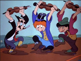
Kimball, if you haven't guessed, points towards the future. He understands line of action and rhythm in a pose. If you single frame Kimball's work, the poses are very strong silhouettes and the rhythms are pleasing.
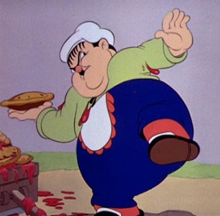
By contrast, Klein looks to the past; he started animating at the Hearst studio in the teens and his animation is just fussy. Klein does a pretty good job of capturing the acting style of Oliver Hardy, but his work is less graceful than Hardy himself.
Take a look at these two images. Both are anticipation drawings.

Look at the long, graceful curves in the Kimball drawing. If you look at the left side of the Groucho figure, the curve starts with the hand and travels all the way through the coat tails. If you prefer, you can follow it down the leg to the foot. Those kinds of long curves give the figures a unity and a flow and they're evident in all three characters.
 In Klein's drawing, the lines keep getting stopped by changes in direction. They're short and they tend to bump into other lines. The body parts don't feel tied together because the linework doesn't flow between them. A good assistant animator could clean-sheet this drawing, push the pose a bit and use a rhythmic line to improve this significantly.
The same lack of rhythm in Klein's individual drawings is evident in his animation. It's not enough to draw a rhythmic pose, your path of action has to be rhythmic as well. Just as Klein's lines are fighting each other, the movement of his character's parts fight each other too. The fussiness in the animation is because the poses and actions aren't tied together with rhythm.
Fred Moore didn't work on this cartoon, but Kimball's work couldn't exist without Moore's. Moore used rhythm to unify individual drawings and unify the sequence of drawings into a coherent statement. Kimball got it and Klein didn't, which is why people talk about one and not the other.


3 comments:
I noticed that the animation on the Laurel and Hardy scenes looked weaker than the movements the real commedians would have made.
Now I know why. Thanks for pointing out Klein's scenes.
Btw, I really liked this cartoon. A pleasant surprise from the Disney studio.
This is the kind of post that I thirst for. Being merely a fan of animation, I keep wondering when I'm watching something "why do I like this" or "why don't I like that"? Tidbits like this are pushing my knowledge of this art further along and I so appreciate it.
..d
Great post--fantastic examples...as "anon" said above--the weaknesses in Klein's drawing exemplifies the stuff that bugged me in early Disney(or other)animation, but I didn't know anough to analyze.
Post a Comment